Ranking all 30 NBA Cup 2025 court designs, from the gaudy to the great
For the third year, the NBA will hold its in-season tournament games on specially designed courts

•
7 min read
The NBA Cup tournament starts on Oct. 31, and in the lead up to it the league unveiled what all 30 courts will look like for the games. In the past, these courts have generated a ton of attention because of their eye-popping designs, player criticizing how difficult they are to play on, or in one case, the Dallas Mavericks were never able to play on their court due to a manufacturing issue.
But this is Year 3 of the NBA Cup courts, and with no issues with last season's courts, it sounds like perhaps they've worked out the kinks with any issues. In this new batch of courts we're getting the most creative designs we've seen yet -- from the good to the garish -- which will surely generate a whole new round of conversation around them.
Now that we know what each court looks like, it's only fair to rank all 30 floors you'll see over the next several weeks.
30. Toronto Raptors
The ransom note font, mixed with the extremely aggressive shade of red makes this the worst of the bunch.
The @Raptors new court for the Emirates NBA Cup pic.twitter.com/cwVzd5oWR5
— NBA (@NBA) October 24, 2025
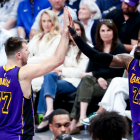
29. Los Angeles Lakers
The Lakers forcing the highlighter yellow across their color scheme has officially gone too far. If this was a true gold, it might be higher, but this is just too bright.
The @Lakers new court for the Emirates NBA Cup pic.twitter.com/TipSW4m1JC
— NBA (@NBA) October 24, 2025
28. Miami Heat
I don't like the brightness of the yellow, but I'm glad they didn't go with red at least. The Heat usually always bring it with their jerseys, so I'm surprised this is so bland.
The @MiamiHEAT new court for the Emirates NBA Cup pic.twitter.com/BpV5H2qUTD
— NBA (@NBA) October 24, 2025
27. Minnesota Timberwolves
I don't know why the Timberwolves keep forcing this Mountain Dew shade of green onto us when they could've consulted literally any of their other palatable colors for this.
The @Timberwolves new court for the Emirates NBA Cup pic.twitter.com/qUvw00ZLI3
— NBA (@NBA) October 24, 2025
26. Washington Wizards
I don't understand the variable shades of red checkered decision. It's like one of those posts that pops up on TikTok when you know you've been scrolling for too long that asks you to find which shade is different from the rest.
The @WashWizards new court for the Emirates NBA Cup pic.twitter.com/HNNgQhNlvt
— NBA (@NBA) October 24, 2025
25. Houston Rockets
Red, but with lasers! They could've done a spaceship lifting off or something. This is just minimal effort.
The @HoustonRockets new court for the Emirates NBA Cup pic.twitter.com/Ne1uJD63lb
— NBA (@NBA) October 24, 2025
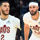
24. Cleveland Cavaliers
The wine color is more palatable than the other shades of red, but combining that with the design feels like it's going to look super busy when you're looking at it in person or on television.
The @cavs new court for the Emirates NBA Cup pic.twitter.com/aB9gFDcMTU
— NBA (@NBA) October 24, 2025
23. Atlanta Hawks
Of the red courts, this is one of the best, and it's still not great. The red is just so overpowering, but the giant Hawks logo at center court make it stand out.
The @ATLHawks new court for the Emirates NBA Cup pic.twitter.com/lTYlHKv49F
— NBA (@NBA) October 24, 2025
22. Denver Nuggets
Why are there so many red courts this year? Not as violent of a shade, but it's literally the worst color to choose when the basketball is orange. Anyway, this beats out the other red courts because the shade of red isn't as offensively bright and they have a fun, massive logo taking up the whole court.
The @nuggets new court for the Emirates NBA Cup pic.twitter.com/vLJYXgPj7f
— NBA (@NBA) October 24, 2025
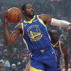
21. Golden State Warriors
I have an issue with how bright the Warriors court is on a regular basis, because of a combination of the light wood and the dominant use of the color gold so this is a nice change of pace. It's boring, but I'd rather stare at this than a bright red court.
The @warriors new court for the Emirates NBA Cup pic.twitter.com/BQsUwWKaR6
— NBA (@NBA) October 24, 2025
20. Brooklyn Nets
Also boring but with a chevron pattern. It's also not too dissimilar from the gray wood courts the Nets have used in the past for non-NBA Cup games.
The @BrooklynNets new court for the Emirates NBA Cup pic.twitter.com/bBlYoZp9WL
— NBA (@NBA) October 24, 2025
19. Phoenix Suns
This court should be purple. This is going to look bad on TV when people are trying to follow the basketball and realize it's difficult when it gets lost in this sea of orange.
The @Suns new court for the Emirates NBA Cup pic.twitter.com/wpvOxwHhmZ
— NBA (@NBA) October 24, 2025
18. Sacramento Kings
Again, this court should be purple! The Kings do get some points for all the lines forming a crown which is a pretty nice touch.
The @SacramentoKings new court for the Emirates NBA Cup pic.twitter.com/w9Er7mIIra
— NBA (@NBA) October 24, 2025
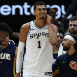
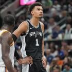
17. San Antonio Spurs
A fiesta-themed court would've been so much cooler. Instead, we get a minimal effort entry. But when you have Victor Wembanyama, you can afford to go pretty simple on things like an NBA Cup court. The giant logo is a bonus though.
The @spurs new court for the Emirates NBA Cup pic.twitter.com/wTWil70MZK
— NBA (@NBA) October 24, 2025
16. Memphis Grizzlies
We've been robbed of a retro Grizzlies Cup court featuring the colors from this year's classic edition jersey. This gray is just sad, it probably would've looked better if the lavender color was the color of the court instead.
The @memgrizz new court for the Emirates NBA Cup pic.twitter.com/l5Z9pLij3O
— NBA (@NBA) October 24, 2025
15. Portland Trail Blazers
If you're going to use gray, this is the way. The dashed lines creating the logo at center court, and when you look at the whole court the design makes it look like it's raining, which we know happens in Portland quite frequently.
The @trailblazers new court for the Emirates NBA Cup pic.twitter.com/96LV2lKmLe
— NBA (@NBA) October 24, 2025
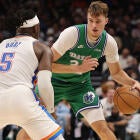
14. Boston Celtics
Way better use of the color green than Minnesota. It looks like Memphis' court, but the green makes it more fun.
The @celtics new court for the Emirates NBA Cup pic.twitter.com/ms4r8F3vQH
— NBA (@NBA) October 24, 2025
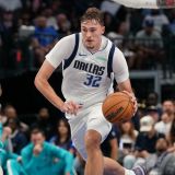
13. Dallas Mavericks
The blue is nice, but here's another team that should be using its retro logo as its main one because this would've looked so cool with the little "M" logo that has a cowboy hat hanging off it.
The @dallasmavs new court for the Emirates NBA Cup pic.twitter.com/mRKQEecG2a
— NBA (@NBA) October 24, 2025
12. Detroit Pistons
Thank you Detroit, for not using red. The big "313" at center court is cool, the blue isn't too bright and the black background will make for a much easier watch.
The @DetroitPistons new court for the Emirates NBA Cup pic.twitter.com/V640tMXAXY
— NBA (@NBA) October 24, 2025
11. Los Angeles Clippers
I like that the Clippers are really leaning into this whole boat thing with their brand refresh. The "Make Waves" on the sideline is a nice touch, and the logo at center court makes it look like the boat is coming straight towards you.
The @LAClippers new court for the Emirates NBA Cup pic.twitter.com/iAf2BiyVFk
— NBA (@NBA) October 24, 2025
10. New Orleans Pelicans
New Orleans has some of the worst jerseys in the league, but they did a good job here. The angry pelican is very menacing, and it's balanced well with the red.
The @PelicansNBA new court for the Emirates NBA Cup pic.twitter.com/cPx5LEG11s
— NBA (@NBA) October 24, 2025
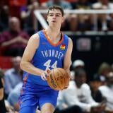
9. Oklahoma City Thunder
Another team with bad jerseys that did a good job. If you couldn't already tell, I'm a sucker for blue courts, and this deep navy looks great. The basketball shield at center court is a nice touch and the orange isn't overpowering.
The @okcthunder new court for the Emirates NBA Cup pic.twitter.com/M52VJaVyci
— NBA (@NBA) October 24, 2025
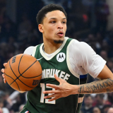
8. Milwaukee Bucks
An appropriate shade of green, the double antlers reaching out to center court and "Fear the Deer" slogan in gold on the sideline, this is a solid design.
The @Bucks new court for the Emirates NBA Cup pic.twitter.com/BM7GGJ4Inq
— NBA (@NBA) October 24, 2025
7. Philadelphia 76ers
I don't like the bright red, but the circle of stars, the "Brotherly Love" slogan on the sideline and the shade of blue makes up for that.
The @sixers new court for the Emirates NBA Cup pic.twitter.com/0w0UbvduSP
— NBA (@NBA) October 24, 2025
6. Chicago Bulls
Now we're getting into elite territory. Yes it's gray, but this is significantly better than the cherry red court the Bulls had the last two seasons. The inclusion of the six-pointed stars that are prominently displayed on Chicago's city flag is a great local touch, and I'm glad that the only place we "see red" on this court is at center court with the "Chicago" logo.
The @chicagobulls new court for the Emirates NBA Cup pic.twitter.com/UW0BejJDlY
— NBA (@NBA) October 24, 2025
5. Orlando Magic
Another gray court that knows what its doing. The Magic are the only team that are doing a tri-colored background, so you know whoever designed this really took their time here. The stars -- even in gray -- look really cool, and it's not too distracting despite it being a pretty busy design.
The @OrlandoMagic new court for the Emirates NBA Cup pic.twitter.com/VLI8F550es
— NBA (@NBA) October 24, 2025
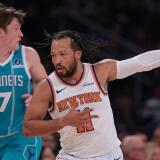
4. New York Knicks
You really can't beat the iconic Manhattan skyline. It would've been even better if the skyline was in a light orange so it really popped, but this is still a great design. It's simple, classic but not boring and speaks to how iconic the city is.
The @nyknicks new court for the Emirates NBA Cup pic.twitter.com/0zhJLqVflL
— NBA (@NBA) October 24, 2025
3. Utah Jazz
Finally, purple! The Jazz might be lottery-bound this season, but they'll have some of the best jerseys -- and now court -- doing it. Everything about this court is perfect. The shades of purple, the decision to use black as the background and the gradient "Utah" logo at center court. I will tune into a Jazz game for the in-season tournament just to catch a glimpse of this court.
The @utahjazz new court for the Emirates NBA Cup pic.twitter.com/jhqEmVTvPC
— NBA (@NBA) October 24, 2025
2. Charlotte Hornets
Charlotte has perhaps the best color scheme in the league, so they always rank incredibly high on these lists. The honeycomb pattern with the teal is so well done. The "This Hive is Alive" slogan makes it more intimidating and the deep purple in the background ties it all together.
The @hornets new court for the Emirates NBA Cup pic.twitter.com/At4lIZly7T
— NBA (@NBA) October 24, 2025
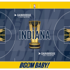
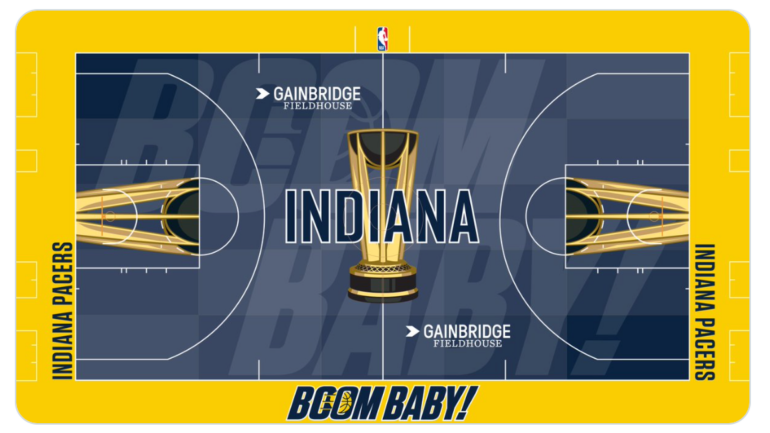
1. Indiana Pacers
Instead of a pattern or logo, the Pacers went with a slogan as the main focal point of their court. The "Boom Baby" looks awesome here and I'm so glad they went with a blue instead of gold because that would've looked awful. For those unaware of the history of the "Boom Baby" slogan, it was the iconic phrase from former Pacers player, coach and color commentator Bobby Leonard. The Indiana native would shout out "Boom Baby" any time a Pacers player would make a 3-pointer.
His wife, Nancy Leonard, who was the Pacers assistant general manager from 1976 to 1980 died in September. Nancy, like Bobby, was a Pacers icon who even after no longer working in the organization remained close with the team, regularly seen sitting behind Indiana's bench at home games. The decision to have this as the court design was no doubt made as a way to honor the Leonard family and everything they've done for the Pacers organization.
The @Pacers new court for the Emirates NBA Cup pic.twitter.com/jfzeuipFcK
— NBA (@NBA) October 24, 2025