

The Buffalo Bills might have done the impossible. it's hard to get everyone on the internet to agree on anything, but everyone definitely seems to agree on one thing this week and that's the fact that the Bills might have just released the worst alternate uniform of all-time.
If you missed it, the Bills unveiled a new "Nickel City" alternate on Monday that features a gray jersey and gray pants paired with a blue helmet. It marks the first time in franchise history that the Bills have worn a gray jersey or a blue helmet.
Bills unveil new alternate "Nickel City" uniforms 🔥
— NFL on ESPN (@ESPNNFL) July 27, 2026
Thoughts on the Buffalo Bills new jerseys? 😯
(📸: @BuffaloBills) pic.twitter.com/JIe8dSxQde
Based on fan reaction, the Bills probably should have kept this uniform combo in the closet.
Let's get a quick reaction from fans:
Who designed these? Some college intern with no business in designing a pro football uniform? Goodness, they look like something straight outta the arena league. Your 2002-2010 duds put these costumes to shame, and that's a tough act to follow.
— Todd Hattrick (@tmatthewshockey) July 28, 2026
the gray is terrible but other than that I hate it
— joelle (@buffaloj0) July 27, 2026
Temu jersey your uncle gets you before never speaking to the family again
— AkeJay (@JKlappss) July 27, 2026
This is the worst part for me. I saw this and felt immediate anger. These look like Power Ranger helmets! #BuffaloBills #BillsMafia pic.twitter.com/m1lDbI4z6R
— Ryan Thomas (@ryanthomastake) July 27, 2026
You know fans are upset when you have the Blue Power Ranger out here catching strays.
Based on fan reaction, it seems the Bills probably should have put a few Focus Groups together before deciding to go with an all-gray look.
I gave the new uniform a C+ during a segment on CBS Sports HQ on Monday night (You can see it here). I like the blue helmets, but I don't like the logo on the helmet, and I don't like the blue paired with the gray. As a matter of fact, I would have loved to see the blue helmet with any other jersey color. I also think gray pants could have worked with a non-gray jersey. This was just a one bad fashion decision after another.
With the Bills getting ripped by nearly everyone for this new alternate look, it got me wondering whether this will go down as one of the worst uniforms of all time, and right now, it's certainly possible.
Here's my ranking of the worst throwback/alternate uniforms of all-time:
1. Jaguars Color Rush
When your starting quarterback comes out and says he hates your uniform, then it's probably a bad uniform, and that's exactly what happened in 2015 when the Jaguars unveiled their Color Rush uniform.
Uniforms Jaguars will wear next Thursday night vs Titans pic.twitter.com/wJESUEYHOZ
— Mark Long (@APMarkLong) November 13, 2015
Officially, the Jags were wearing a color called "Bold Gold," but to anyone with two eyes, it was pretty clear this was more of an all-mustard look that should have never left the drawing board. Blake Bortles, who was the Jaguars QB at the time, hated the fact that he had to wear the mustard-colored uniforms.
"I think they're ugly as hell," Bortles said at the time. "I am not a big fan of the mustard. ... I think they should choose a different color."
It's possible that someday, we'll see someone combine a mustard jersey with gray pants, but until that happens, this will remain as the worst alternate/throwback jersey of all time.
2. Eagles 1934 throwbacks
I'm not the first person to rank the ugliest uniforms in NFL history, and I certainly won't be the last, and if there's one thing that all of these lists have in common, it's that the Eagles' 1934 throwback is always in the ranking. It's the modern standard for ugliest throwback.
During the 2007 season, the Eagles decided to celebrate their 75th anniversary by wearing their 1934 uniforms. There are only two seasons in Eagles history where the team didn't wear green, and 1934 was one of them. During their first two years of existence, the Eagles wore a gold and baby blue jersey.
Eagles 1934 throwbacks. Hideous, glorious or both? pic.twitter.com/q3nvOTcZXS
— FB_Helmet_Guy (@FB_Helmet_Guy) February 2, 2025
Throwing it back to when we wore the 75th anniversary yellow and blue jerseys. pic.twitter.com/3WAQkIlbYA
— Eagles History (@EaglesHistory) September 24, 2025
As the Chargers have proven, these two colors can make an amazing uniform, but not when combined. If the Eagles had gone with just baby blue or just gold, they might have been able to put together a solid uniform combo, but instead, they combined the colors and came up with this hideous mishmash.
I know 2032 is still six years away, but I'm already dreading it just knowing that the Eagles might once again break these out for the team's 100th anniversary.
3. Broncos AFL throwbacks
When the owner of the team decides that he needs to set every uniform on fire to burn them out of existence, then you probably have a bad uniform, and that's exactly what happened with the next uniform on our list. During the Broncos' first two years of existence, they wore a yellow jersey over Brown pants. If there are two colors you should never combine under any circumstance, it's brown and yellow.
After the Broncos switched to their orange and blue uniforms in 1963, the team decided to get rid of their old uniforms by burning them.
From the Broncos' website: "The home combination — a mustard-yellow jersey with brown numbers and no name block, brown pants with mustard-yellow double stripes, and brown and yellow vertically striped socks — was so hated that a public bonfire was held by the team in front of a cheering crowd to burn the uniforms."
Although the uniforms were hated, the Broncos brought them back in 2009 and wore them for the AFL's 50th anniversary season.
AFL Denver Broncos is by far the worst throwback. The socks make them look like oompah-loompah's. pic.twitter.com/VDoSjAKI2h
— Bryan Beban (@bkbeban) July 25, 2016
Currently re watching the #Broncos 2009 win over the #Patriots and I forgot how fun this game was besides the horrendous AFL throwback jerseys. The atmosphere was electric with the #Broncos being 4-0 at the time. pic.twitter.com/OtcjSHa8LL
— Tanner Lee (@TannerLee92) May 10, 2020
The Broncos also had a white version of these throwback uniforms, and those were much better. As for the yellow ones, I hope the team decides to have another bonfire to get rid of them.
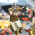
4. Steelers 1934 throwbacks (AKA the bumblebee uniforms)
I'm not sure what was going on in Pennsylvania in 1934, but it almost seems like the Steelers and Eagles were competing to see who could design the worst jersey. The Eagles' 1934 throwbacks came in at No. 2 on this list, and now we have the Steelers' 1934 throwbacks ranked fourth ugliest.
These are the famous bumblebee jerseys that the Steelers wore for five games between 2012 and 2016.
The most famously terrible uniforms: the bumblebee Steelers uniforms. pic.twitter.com/rOv3pB7eZ3
— Auburn Blazer (@AuburnBlazer) April 14, 2019
Putting horizontal prison stripes on an NFL uniform just seems like a bad idea. I think my biggest problem with this uniform is that the pants don't make any sense. If the Steelers had worn black pants with the bumblebee uniforms, I probably wouldn't have ranked them on this list, but they decided to wear a mustard-gold color that hurts your eyes just to look at.
5. Packers 1929 throwback
It's been 12 years since the Packers have worn this throwback, and that's probably for the best. The Packers wore this throwback for the first time in 2010, and they wore it multiple times through the 2014 season. However, they did make one big change during that five-season span. In their first game with the throwback, they wore a brown helmet.
Green Bay packers 1929 throwback. pic.twitter.com/LgfV0AJzqK
— Shane Rodrigues (@SRodrigues52) June 17, 2019
When they wore the uniform for the final time in 2014, they wore a gold helmet (The NFL implemented a one-helmet rule from 2013-2021, so the Packers were only allowed to wear one helmet color in that span and that was their gold one. The one-helmet rule was rescinded in 2022).
.@packers throwback uniform is from 1929- year of first NFL title. Rodgers grateful it doesn't include leather helmet pic.twitter.com/chYdMdUiZb
— C4NFL (@C4NFL) November 16, 2014
I don't love either combo, but the version with the brown helmet is the one that we're officially putting at No. 5 on this list.
6. Giants' 100th anniversary uniform
For the 100th anniversary of their franchise, the Giants went full Frankenstein in 2024, creating a throwback jersey that ended up combining a bunch of things they probably shouldn't have. They used a 1938 helmet design, a 1933 jersey design, and they added pants and socks from a 1925 uniform combo.
They put all that together and they got this:
These are the #Giants’ Century Red uniforms for their 100th anniversary season. They will wear them up to 2x this season. Also, Kayvon Thibodeaux has a party flowing out of the back of that helmet pic.twitter.com/3hBaUmPDre
— Pat Leonard (@PLeonardNYDN) May 16, 2024
Based on this final product, I'm going to guess that no other team will ever combine eras again. I actually like the helmet, which is the only reason this combo isn't ranked higher on our list of ugliest uniforms.
7. Bears 1920s throwback
During the NFL's 75th anniversary season in 1994, every team wore at least one throwback during the year. As one of the oldest franchises, the Bears decided to throw it back as far as possible by bringing out a uniform style dating back to the mid-1920s.
Or the Bears 1994 NFL 75th anniversary uniform.
— Patrick McDonald (@Saintspat) December 30, 2020
Who need numbers on the front? pic.twitter.com/KohsP5gBDH
These uniforms were unique because there was no number on the front and I didn't realize how much I needed a number on the front until I saw these things. One interesting thing about the stripes on the jersey is that when the Bears first unveiled them in 1920 -- when they were known as the Decatur Staleys -- the skill players were the only ones who had stripes on their jersey.
Fun fact: For the NFL's 75th season, the Bears wore jerseys with vertical stripes to honor the 1925 Red Grange team.
— Jack M Silverstein 🇺🇸 (@readjack) September 17, 2020
But the original stripes in 1920 were functional, not aesthetic: strips of material that helped ballcarriers grip the ball. For ends & backs only, as seen below. pic.twitter.com/rWJfJcsYgz
And now, let's take a look at the pants. Once again, we have the gold pants that don't really match any other part of the jersey. Based on these rankings, it seems like I'm not a fan of mismatched gold pants.
And that is it for these rankings. I only ranked the seven worst uniforms because I feel like these seven stand alone as the worst ones in NFL history. That said, if I had done a top-20 ranking, the Bills probably would have cracked the list.
The problem with the Nickel City uniform is that it makes no sense. If the Bills wanted to fully embrace the 'Nickel City' nickname, they could have done that, but they didn't. Here's a mock-up from a fan of an all-gray jersey that looks better than the one the Bills unveiled.
Fixing the Buffalo Bills “Nickel City” Alternate Uniforms:
— JP Sports Design (@jpsportsdesign) July 27, 2026
- Dark Gray and Navy Blue
- Reflective Metal Accents
- Low-Polygon Pattern Inspired by New Buffalo Statues https://t.co/RiVV0KCFFx pic.twitter.com/1cUmnw0vjI
The Bills probably should have just held a contest to let fans design the uniform, because there were many ideas that were better than what the Bills ended up going with.